


The rest of this series of Loop Signature articles is devoted to the dynamics of virtually every type of process encountered in industrial control analysis. The purpose is to allow you to identify the dynamics of any process, and then apply the most appropriate tuning for that process. Many people who have attended Part 2 courses have subsequently managed to tune difficult processes in their plant that had previously always been in manual, or working extremely badly in automatic.
To understand this section, a basic understanding of frequency plots is very useful. Most people who have studied control will have encountered frequency plot theory at some stage in their studies. However, very few people really understood what it was about, and even fewer have ever used the theory in real life. This is probably because it is impossible to generate frequency plots without the right loop analytical tools, such as Protuner Loop Analysis software.
The basics of tuning theory were covered in Loop Signature No. 23, on the ‘Basic Trouble Shooting and Loop Tuning’ CD. This section repeats that material.
Frequency response testing
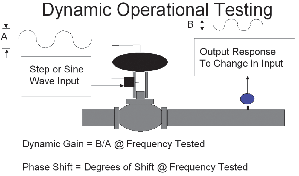
Following the original ideas postulated by the early mathematicians who developed the theory, notably Nichols, one should perform a full frequency response test on a control loop. As illustrated in Figure 1,
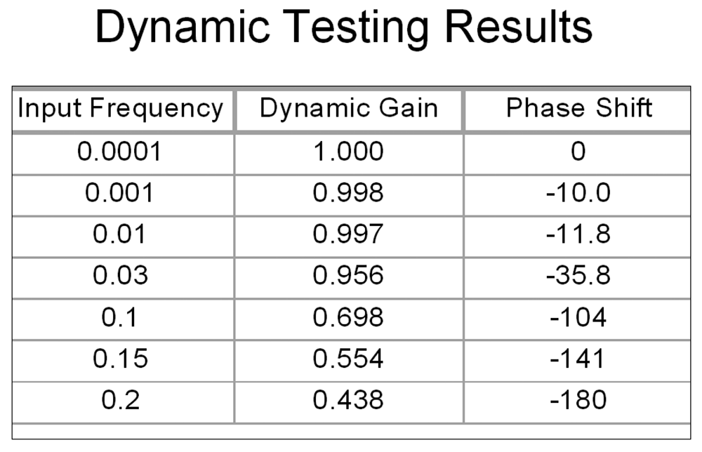
a sine wave is generated onto the input to the process (process demand). Initially the sine wave must be at a very low frequency. A sine wave of the same frequency will appear at the output of the loop (process variable). The amplitudes of the input and output sine waves are measured and their ratio calculated. This is called the dynamic gain. The phase difference is also measured. The test is then repeated at a slightly higher frequency, and this procedure is repeated with higher and higher frequencies until the output lags the input by a phase difference of −180°. At this point, if the control loop were closed, the feedback contribution to the process would start pushing the valve in the wrong direction, and instability would result. Figure 2 shows an example of such a test.
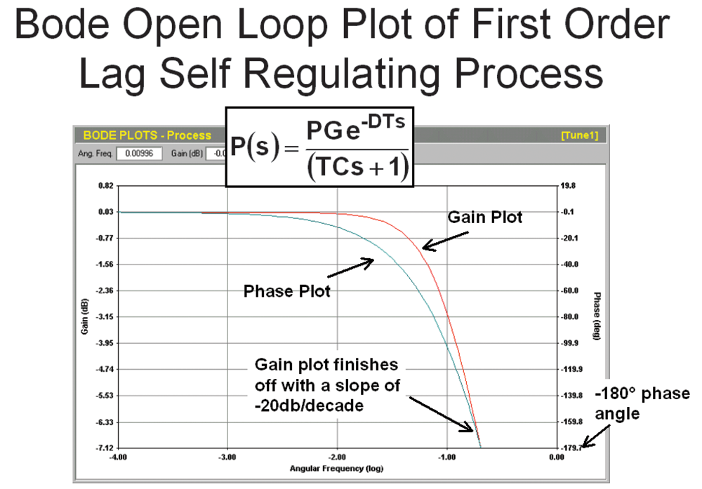
The next step in the tuning procedure is to draw a frequency plot from the test data. The various mathematicians came up with slightly different plots. A Bode open loop plot is shown in Figure 3, consisting of two graphs: dynamic gain versus frequency, and phase lag versus frequency.
Bode open loop plot for a first-order process
The first process type to be examined is the simple one already discussed in this series, the first-order lag, deadtime, self-regulating process, which is the type many of the simpler industrial processes more or less conform to.
The Bode open loop plot for this process is shown in Figure 3.
As mentioned above, the Bode consists of two graphs, dynamic gain versus angular frequency in radians per second, and phase lag versus angular frequency. Dynamic gain is expressed in decibels where:
Gain (dB) = 20 × log₁₀ (absolute gain)
The term ‘absolute gain’ is used here for the ratio of the two gains measured in percent of measurement range. The phase lag is in degrees, and the horizontal frequency axis is a logarithmic scale.
For this particular dynamic, working from lower frequencies on the left to higher frequencies on the right, the gain plot starts off horizontally, and then begins dropping until it finishes with a slope of −20 dB/decade at the point where the phase plot reaches −180°. The slope would be −40 dB/decade for two lags, and −60 dB/decade for three lags. Like all self-regulating processes, the phase plot also starts horizontally at 0° and ends at −180°.
Information from the gain plot
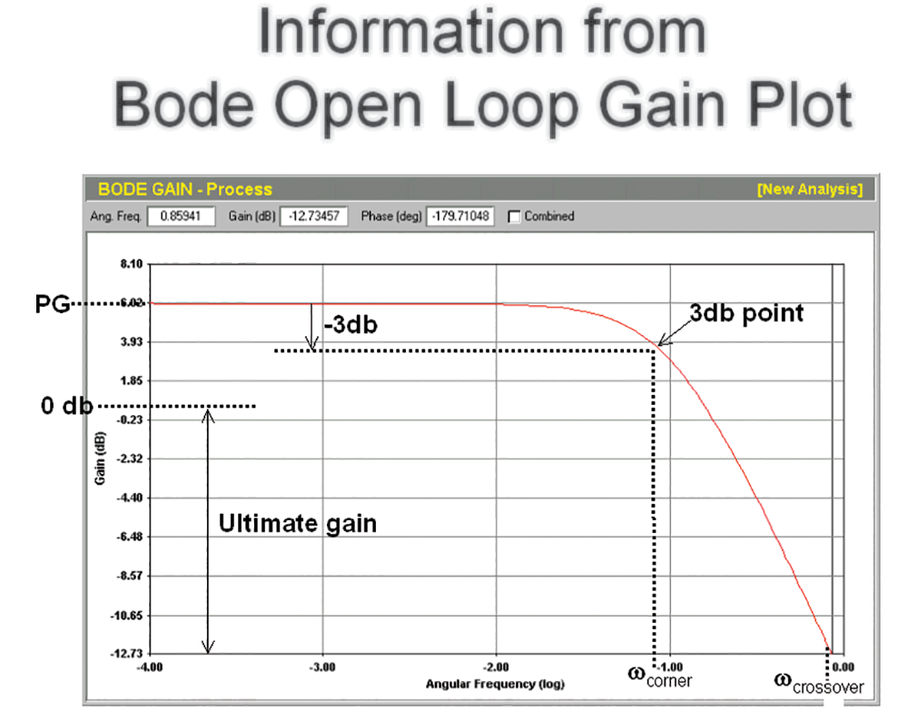
The value of the gain where the plot intersects the vertical dynamic gain axis is the process gain, obtained by making a step change on the controller output, and discussed in detail in the Part 1 Loop Signature series. This is logical, because if the frequency is slow enough, the dynamic gain must equal the process gain.
The frequency where the phase lag reaches −180° is known as the crossover frequency, also called the ultimate frequency, which will be discussed later. Moving down by −3 dB from the intersection of the gain plot with the gain axis, and drawing a horizontal line rightwards to intersect, the gain plot gives the corner frequency: ωcorner. The value of the lag time constant can then be obtained from:
TC = 1/ωcorner (seconds)
The last piece of information easily obtained from this plot is the ultimate gain, which will also be revisited later.
This will be continued in the next Loop Signature article.

Michael Brown is a retired expert in control loop optimisation, possessing over five decades of experience in process control instrumentation. His primary focus has been consulting and delivering instruction on practical control loop analysis and optimisation. He has conducted training and optimised control systems at numerous facilities internationally. Mr. Brown continues to author articles reflecting his extensive work, and his courses remain accessible for purchase in PDF format. Additionally, he manages the distribution of Protuner Loop Optimisation software and welcomes inquiries regarding loop-related issues.
Contact details: Michael Brown Control Engineering CC,






© Technews Publishing (Pty) Ltd | All Rights Reserved
 printer friendly version